georgia o’keefe museum
CULTURAL INSTITUTION, REIMAGINED
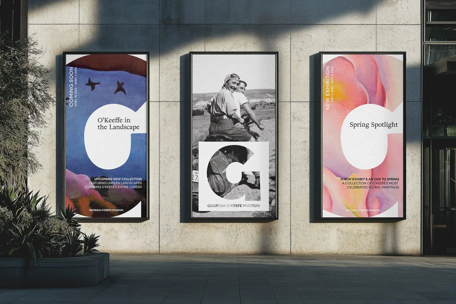
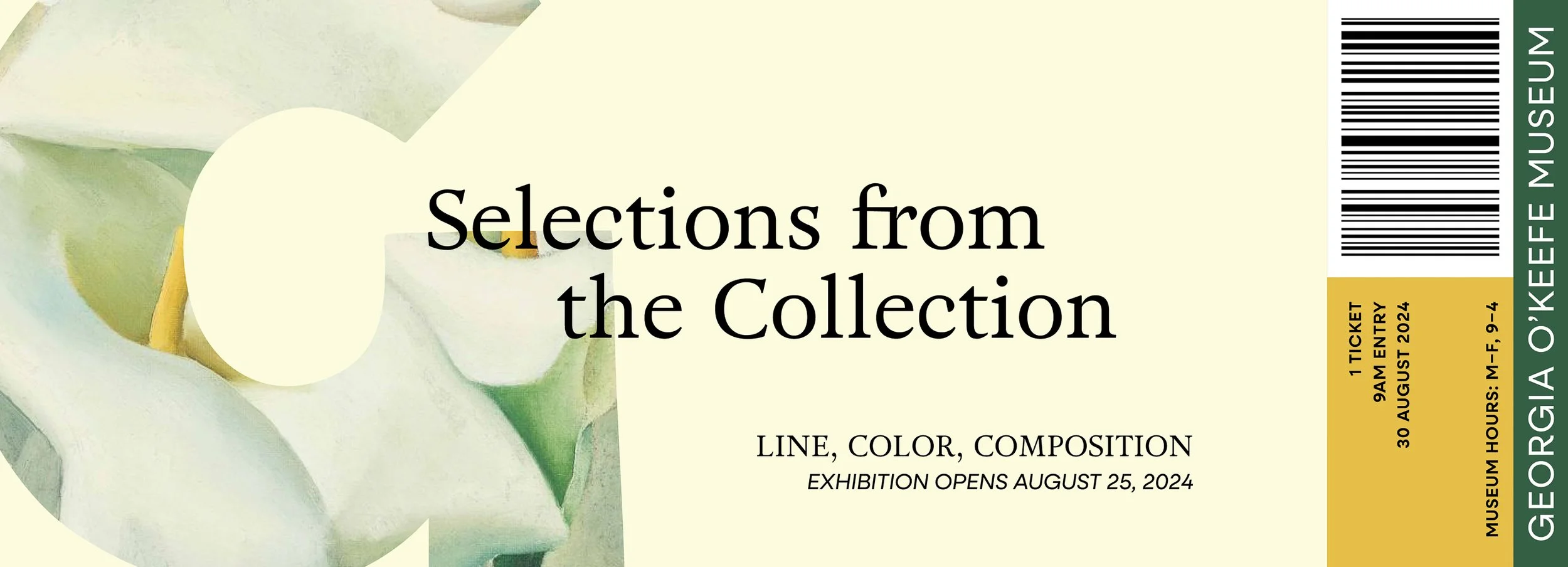
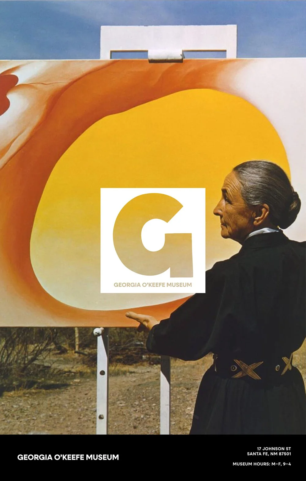
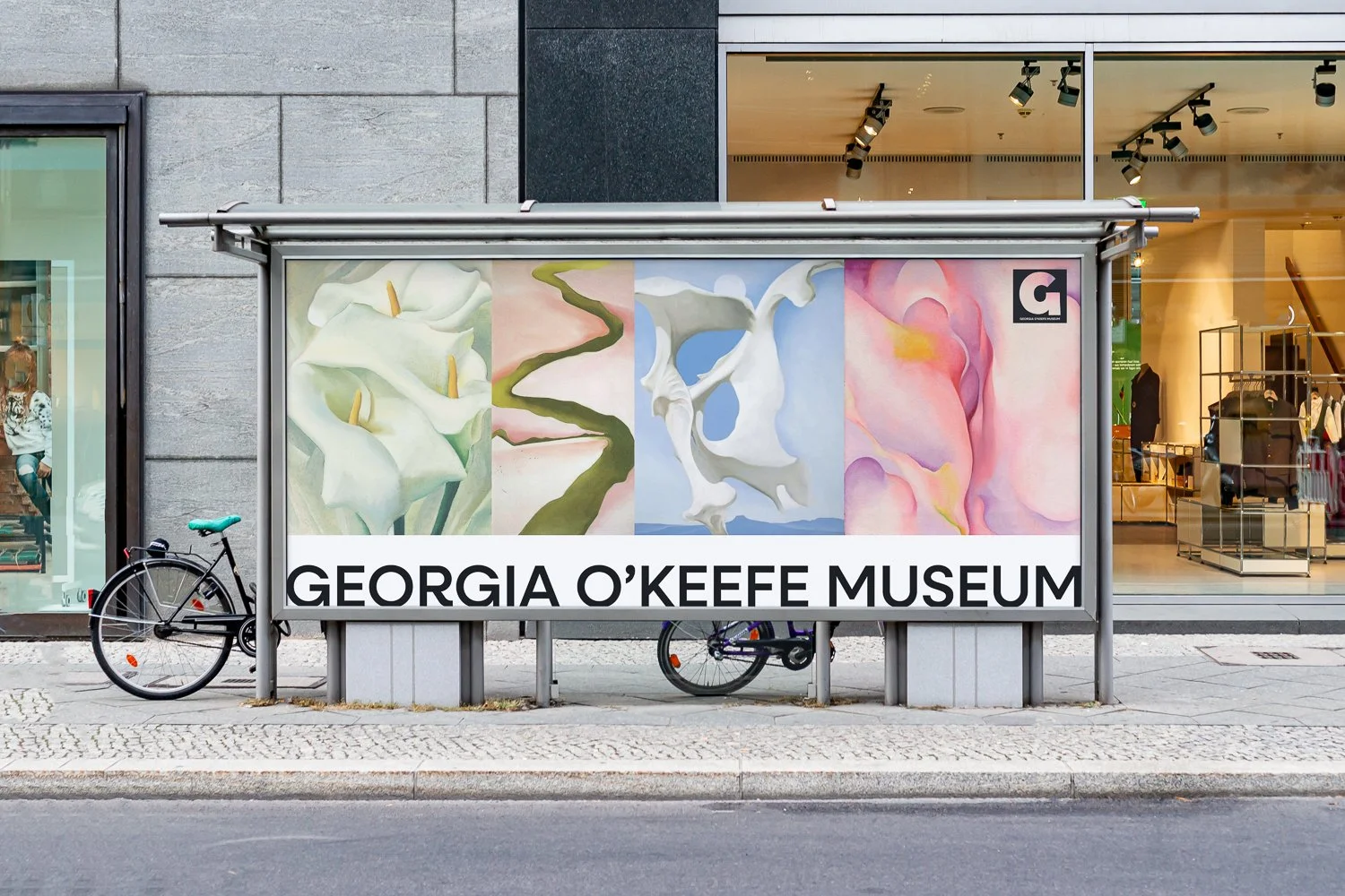
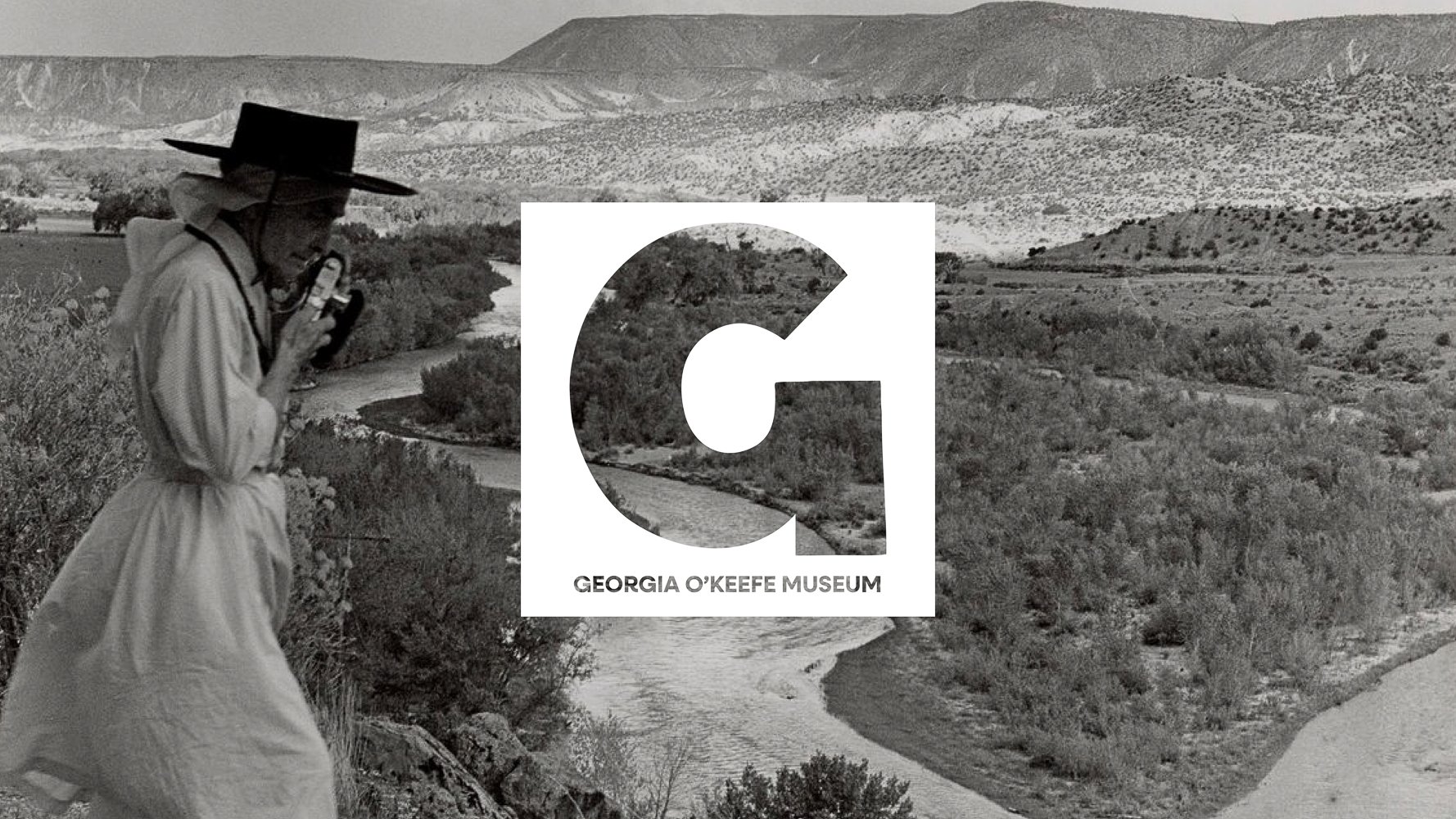
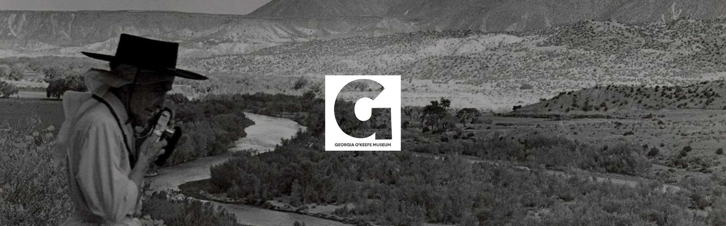
The Georgia O’Keeffe Museum deserves a visual identity as bold and contemporary as O’Keeffe’s own work. My reimagination revolves around a single, handmade G – a large, thick, contemporary sans-serif letterform that becomes the museum’s primary symbol. It’s sculptural and minimal, creating a window and tether to the modernity, scale, and intention found across O’Keeffe’s paintings.
This G forms the foundation of a flexible typographic system. For all supporting text and the full museum wordmark, I paired it with simple and approachable serif typeface Neulis Neue that has subtle character, particularly in the expressive kickstand of the R. This serif adds warmth, humanity, and a hint of the handcrafted quality present in O’Keeffe’s brushwork, balancing the large simplicity of the main mark.
Rather than introducing a new color palette, the visual system draws its color identity directly from O’Keeffe’s work and the New Mexican landscape that inspired her, and myself. The core brand materials remain neutral, mostly black and white, allowing the colors of the art itself to take center stage. When color appears, it comes from the pieces displayed inside the museum or from the surrounding environment: sage greens, adobe pinks, desert ochres, and bright skies. This approach ensures that every application feels rooted in O’Keeffe’s world, while the museum branding remains clean, contemporary, and unobtrusive.
The overall goal of this rebrand is to make the museum more relevant to a new generation by embracing scale and simplicity. The handmade G becomes a visual anchor that is strong enough to stand alone, yet adaptable enough to support the museum’s full range of communications and usage.
SERVICES:
museum brand identity
logo design
graphic design
art direction